Showing posts with label colour. Show all posts

Wednesday, 14 October 2015

Difference

From day to day I keep seeing things in terms of "difference that makes a difference". Since I've not posted anything on here for a while, here's a couple from the last few hours.

a)
"God created suffering so that joy might appear through its opposites. ... Things become manifest through opposites. Since God has no opposite, He remains hidden."
Words of Rumi* in Elif Shafak's "The Forty Rules of Love". (Penguin Books 2015 ed., p121)

* Jalāl ad-Dīn Muhammad Rūmī was a 13th century "poet, jurist, Islamic scholar, theologian, and Sufi mystic" (from Wikipedia, version as of 16:38, 12 October 2015)‎. I've no idea whether these really are his words of the words of Shafak.

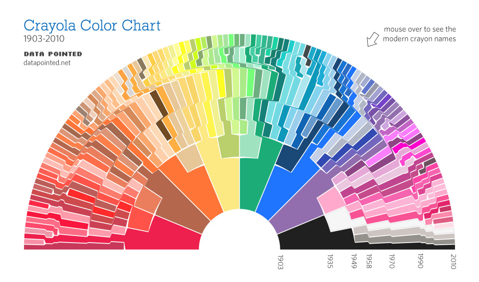
 b)      A colour chart showing how Crayola have expanded the range of colours in their crayons since they started with eight in 1903.


From Somewhere Over The Crayon-Bow.

Friday, 11 March 2011

The information content of the referee's cards

On Wednesday the referee at Everton - Birmingham City match apparently forgot his cards, so he improvised:

He raises his hand as if holding a card.  When I saw this on the TV news, the presenter queried the colour of the imaginary card, but of course it must have been yellow because the player remained in the pitch.

Suppose the player had gone off, would their have been a doubt whether it was a second yellow or a straight red? No, because in the case of a second yellow the ref would have raised his hand twice: one for the second yellow and once for the consequent red.

So it seems the actual card is not necessary?  There are a number of functions it serves.

1   First, it increases the signal-to-noise ratio.  It is much easier to see the brightly coloured card than notice whether the ref has deliberately raised his hand miming the holding of card - though for the purpose the card colour doesn't matter, fluorescent pink might to the job better.

2   The actual colour of the card provides redundancy (in the technical, information-theoretic sense). This is perhaps important in the communication with the player, especially since the ref and player might not speak the same language (though 'you're off!' wouldn't be difficult to understand), and for the spectator might be most important with the 'two yellows or straight red' distinction.

3  In the language of semiotics, the emotive function of the card also needs to be considered.  Actually seeing the card colour would stir up feelings.  The appearance of the coloured card would immediately link in to all the associations from past experiences.

One final thought, the action of the referee in miming the florishing of a card worked because we have seen refs do that with real cards in the past.  Isn't this the way signs develop? Over time a 'real action' becomes replaced by a stylised sign?

Tuesday, 16 March 2010

Information content of colours

After writing that post yesterday, coincidentally that evening on TV (on 'The One Show', I think) there was an item about the use of colours to identify brands. They gave the example of the blue of Cadbury's Dairy Milk and the red of Coca Cola, I think, if I remember correctly.

I was thinking about my pink. What might it convey? Now I think about it, two things I might associate with a pink: 'Gay', and 'Breast Cancer awareness' ('pink ribbon'). I wasn't actually meaning either of those, so if it did convey that, it was false: the colour does not contain that information on this occasion.

The amount of information that a colour could convey is quite large, but depends on the viewer's colour resolution. This links back to my musings on the Damien Hirst's spot paintings a while back. Actually, I say it's quite large, but we're only talking about 24 bits for 'Truecolor', and as I was saying yesterday, that's tiny compared to what you can convey with a few words. I don't know, there's something not quite right with this argument.

The programme also talked about football strips. The information content of those is worth exploring. I think they convey three things:

1) the identity of the club
2) the identity of the sponsor of the strip
3) the season (clubs change their strip each season - in encourages fans to buy a new replica strip each year)

Sometimes some strips are very plain, sometimes they are intricate. I'd suggest that they don't convey any more information by being intricate. The added complexity is merely 'decoration', or information terms it is either redundancy or noise. In some cases thinking of it as noise would make sense, since I think it can make it more difficult to extract the identity of the club from it.

There's a lot more that could be explored - home and away strips, the experimental finding that teams wearing red gain a measurable advantage compared to clubs wearing blue. (Reported in the New Scientist a while back. Evidence includes the relative successes of Liverpool and Manchester United compared to Everton and Manchester City.)

Monday, 15 March 2010

Information content of personalisation

I've just upgraded to Firefox 3.6 and was given the option of choosing a 'persona'. This allows me to select images/colours to appear at the top and bottom of my screen. See http://www.getpersonas.com/en-US/gallery/All

I was taken aback to find that there's currently more than 76,000 to choose from, with more being added all the time (anyone can create one and upload it).

In Theories of the Information Society Frank Webster suggests that the choices available today in 'personalisation' are one example of there being more information around today than in the past. Specifically, in the context of clothing, he suggests that the medieval peasant’s smock contained a lot less information than the clothing of even the poor today.

I suppose by choosing one out of 76,000, you might argue that I am providing something like log2(76,000) = 16 bits of information about myself.

The more popular the one chosen, the less information it represents in this calculation. I am currently using 'Olivencia Pale Pastel', and the website says there's '1 active daily user' of this scheme - I'm not sure whether that means me or someone else. Others have hundreds, thousands or tens of thousands of users, so mine is an obscure choice, and therefore probably represents rather more than 16 bits of information.

Except it doesn't. I certainly didn't go through all 76,000 and chose this one. A little bit of thought did go in to finding it, maybe 5 minutes, but a large part of the decision was random chance.

If I had time, I would create my own using my own image files. I guess that would then represent more information about me. But maybe 'if I have time' is the key. There's no shortcut to producing information, it takes time.

(And anyway, even if it did represent 16 bits, or 32 bits, say, that's still pretty small compared to a few words.)

Update:

Hehe, look what Olivencia Pale Pastel looks like with the colours in my blogger! Even I can tell that's terrible. It's so bad I've got to keep it now.

Friday, 5 September 2008

Forging a Damien Hirst

How much information is there in one of Damien Hirst's spot painting?

I was prompted to think again about Damien Hirst by the news of his plan to auction some of his artwork directly, bypassing the dealers.

Consider one of his spot paintings: Lysergic Acid Diethylamide (LSD). There's been a lot said about these paintings, but I want to think about their information content.

It is easy to generate an image of this painting, or something similar, on the computer. I've been playing with this.

1) Drawing an image in Adobe Illustrator. I had a go at this, aiming to match (approximately) the relative dimensions (ratio between spot diameters and spot spacing) and getting a rough match of the colours. I saved it as a jpeg file using the settings for maximum quality, which gave a file size of 110 kbytes. I've pasted it below.


At minimum quality, the files size is only 14 kbytes, but the quality is significantly reduced:


2) I then wrote a VBA macro to generate a similar image in microsoft powerpoint (I'm just using tools that I have ready to hand). Here is the complete macro to generate a diagram with the same dimensions, but randomly colouring the circles:

Sub draw_lots_spots()
col_start_pos = 25
row_start_pos = 25
For rownum = 0 To 10
For colnum = 0 To 12
col_pos = col_start_pos + colnum * 45
row_pos = row_start_pos + rownum * 45
red = Int(256 * Rnd)
green = Int(256 * Rnd)
blue = Int(256 * Rnd)
ActiveWindow.Selection.SlideRange.Shapes.AddShape(msoShapeOval, col_pos, row_pos, 24, 24).Select
With ActiveWindow.Selection.ShapeRange
.Fill.Visible = msoTrue
.Fill.Solid
.Fill.ForeColor.RGB = RGB(red, green, blue)
.Fill.Transparency = 0#
.Line.Visible = msoFalse
End With
ActiveWindow.Selection.Copy
Next colnum
Next rownum
End Sub


Saved as a text file, it is 598 bytes. (Paste this text into a VBA module in PowerPoint, then run the "draw_lots_spots" macro from a blank slide and you'll get the spots.)

3) Finally, I wrote a similar macro but combined it with a data file that contained the RGB parameters for the colours of each circle. The macro text file in this case was 636 bytes, while the data file with the colour information was 1676 bytes. Combining the macro and its data in a zip file, gave a total compressed file size of 1344 bytes.

So, what does all this say? There is a sense in which I've got an image of Hirst's LSD painting down to 1344 bytes (on the grounds that the choice of colours must have been significant). This is 'algorithmic information', and it's not many bytes - a lot fewer than required for 1919 for example. Of course, I am aware that this little image on the computer is a long way from the real meter-square painting. I'm imagining using this, from the computer, as a recipe for doing a real painting. So you could add to the VBA macro the instruction "Copy this enlarged to 106.5 cm x 127 cm using gloss paint on canvas" (or whatever was used), then you have an algorithm for getting something like the original. I don't know enough about the technique to know how close this would get you to the original. I suspect those who know might deride my suggestion that it gets you anywhere near, but it would surely get you some way towards it.

Compare this to Degas's The Bellelli Family that I discussed earlier. I can't think of any way that an algorithm could be used to construct anything resembling the painting. Compressing using JPEG, I reckon that about the minumum file size that gives you anything remotely useful is about 14 kbytes, which gives the following (I'm assuming no-one is going to worry about copyright issues with a copy - which is from the Independent article - of this poor quality)


Actually, I'm not quite sure where this argument is going. I'd had in mind that I would be able to say something along the lines of Hirst's painting containing so much less information, and that therefore the value of Hirst's is almost entirely in the context, whereas Degas's contained lots of information within the painting. I'm not sure that is coming out quite so clearly.

Enough for now. [More on this in a later post.]