Showing posts with label art. Show all posts

Wednesday, 14 October 2015

Difference

From day to day I keep seeing things in terms of "difference that makes a difference". Since I've not posted anything on here for a while, here's a couple from the last few hours.

a)
"God created suffering so that joy might appear through its opposites. ... Things become manifest through opposites. Since God has no opposite, He remains hidden."
Words of Rumi* in Elif Shafak's "The Forty Rules of Love". (Penguin Books 2015 ed., p121)

* Jalāl ad-Dīn Muhammad Rūmī was a 13th century "poet, jurist, Islamic scholar, theologian, and Sufi mystic" (from Wikipedia, version as of 16:38, 12 October 2015)‎. I've no idea whether these really are his words of the words of Shafak.

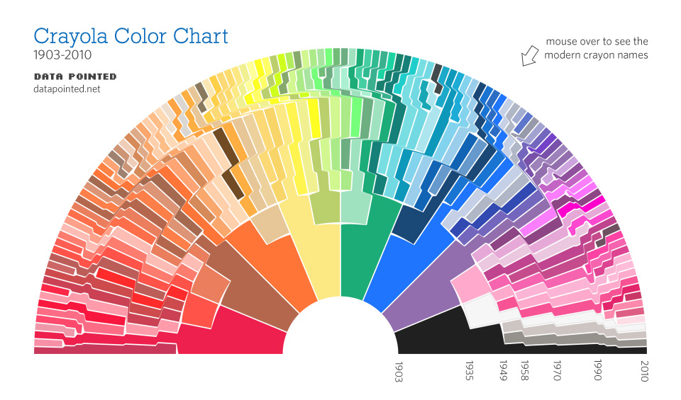
 b)      A colour chart showing how Crayola have expanded the range of colours in their crayons since they started with eight in 1903.


From Somewhere Over The Crayon-Bow.

Tuesday, 24 February 2015

The cover image for a module as information

It has reached the stage where the TM353: IT systems: planning for success  module team needs to choose a cover image for the printed booklets. This is more difficult and fraught than you might imagine!

But here's some thoughts on it, using my 'trapezium' formulation as explored in Chapman 2014. Looking at the image is an information event ("a situated event that generates meaning"). Any information can always be interpreted both as semantic information and as environmental information.

As semantic information, it is about communication and therefore there has to be a source. In this case the source is the module team selecting the image (see below), and the image as 'data' carries the message to the recipient.

The trouble is that this model assumes that the recipient interprets the data 'correctly', which is to say the two trapeziums are perfectly matched. But of course they never are. Even if the recipient is the same person (same people) as the source (so the communication is storage, and communication is through time rather then space), the recipient will have had more experiences so will never interpret the data in the same way twice (you can never step in the same river twice).

So this leads to the alternative model of environmental information. The recipient is always creating meaning from the data.

So, in the case of us choosing the cover image, we can try to chose one to communicate a message, but - especially since there are lots of different recipients some of whom are in rather different contexts from the context that we are in - the recipient will inevitably get a different message from the one we intend.


So, does this help us choose an image? Maybe, maybe not.

Anyway, this got me thinking about the images used on past modules that I've worked on, and here are a few of them - all 'telecoms/comms' modules.

The first two date from around 1990.  In both cases, the module team were thinking in terms of 'networks'.  Would have got that?  I don't know whether the students would have. What I do think they have going for them, though, is that they are distinctive, and so after having seen them once,  I think the 'message' becomes 'this is PT629' and 'This is T322', which is surely not a bad thing!

There is a (quite) interesting story about the second of these, the red one of T322.  If I remember the story right, the module chair, Gaby Smol, had in mind a painting by Mondrian which he thought had in it the idea of networks, but when he tried to track it down couldn't find it. So the artist for the module (ie the person who did all the diagrams) created something along the lines of what Gaby thought he'd seen, and this resulted in the 'tree' on the cover.


Next up T305, from around 1999. For this, we were thinking in terms of layers to link to the OSI 7-layer model of protocols, and TCP/IP layers, and the general idea of layering as a way of structuring communication processes. We wondered about archeological layers and sediments, and armed with that idea, the artist came up with the following. 


One thing that worked well with this, the T305 image, is that we had three different types of booklets for this module ("Systems and Processes" booklets, "Activity Booklets" and a "Reference Book").  The same image was used for each type, but in a different colour. Above was a Systems and Processes book and below is the Reference Book.


I know this was useful for students because they'd refer to them by colour in the forums.

Next up is T822, around 2003. This was back to the idea of networks again, and we also made use of colour coding because a companions module, T823, used the same design with a red and blue combination.


By the time we came to T325 in 2009. the University was trying to encourage a more consistent brand image, and wanted photographs containing people, hence the following.


This is fine,  but I think it loses some of the distinctiveness of the earlier abstract images. Also, as soon as you put people on the covers, you get in to the perilous territory of stereotypes, tokenism, political correctness, exclusivity... 

Personally, I much prefer the abstract covers. The 'Mondrian' of T322 and the layers of T305 are my favourites and I think they did job they needed do. Would the students (or anyone else seeing them) have got the messages that the module team had in mind? Probably not. Did that matter? No, I don't think so. At least they wouldn't have got the wrong message...  and I think they would have got some sort of message about the module being, I don't know, serious but friendly? Maybe that it has some subtlety to it?
Monday, 4 March 2013

Our symbolic culture

Humans today live in what we call a symbolic culture. All the objects around us have a symbolic dimension. The clothes we wear, for instance, send out signals about us that are unrelated to their practical function. We form symbolic relationships where no biological relationship exists, with a husband, sister-in-law, godchild, blood-brother, for example. Language, of course, is another key example, the relationship between the words and the objects and concepts to which they refer is completely arbitrary and that is the essence of a symbol.

Neanderthals created few symbolic artefacts. Before about 50,000 years ago there is very little evidence of any that stand up to scientific scrutiny.

All work and no play: Why Neanderthals were no Picasso - opinion - 27 February 2013 - New Scientist
Of course there is also a symbolic dimension even to the lives of animals. See previous posts about the peacock's tail, and if you argue that growing a tail isn't 'creating' an artefact, what about Bower Birds? And there has been recent research showing that Dolphins call each other by 'name'.

Perhaps the use of symbols is not a distinction between Homo Sapiens and Neanderthals, nor even between humans and animals, but characteristic of life. I wonder, could that be in there as the, one of the, defining features of a living organism?

Tuesday, 24 July 2012

The artist's hand

When I was at the Turing 12 art exhibition Intuition and Ingenuity at Birmingham University, I overheard Anna Dumitriu explaining to another visitor about the movement to remove the artist's hand from art. I found myself wondering how much of the artist they were wanting to eliminate. How far away are you pushing the artist? In terms of the layers and trapeziums, I can think of it being about removing the artist from the lower layers, but how far up do you go? The artist presumably must still be there at the top? There must be some idea; some emotion; some something to communicate?

But then I was once told that some artists would baulk at talking about art as communication. I remain to be convinced about that. I can't see how it could be about anything other than communication in the most general sense.  It is true, however, that I've no expertise in art, so when I say 'I remain to be convinced', I'm not meaning 'I'm not going to let you convince me'. If someone could explain art to me in way that doesn't involve communication, I would learn a lot from it. (It would be lots of information for me, because low probability = high information, in the Shannon sense.)

Well anyway, I could do with finding out more about this movement and the 'hand of the artist', so to start with here's a couple of things from a google search.

Making sense of Marcel Duchamp:
If you want to break all the rules of the artistic tradition, Duchamp reasoned, why not begin by discarding its most fundamental values: beauty and artisanship. The readymades were Duchamp’s answer to the question, How can one make works of art that are not “of art”?

It was an audacious proposal, and to execute it Duchamp employed an equally audacious method: he withdrew the hand of the artist from the process of making art, substituting manufactured articles (some custom-made, some ready-made) for articles made by the artist, and substituting random or nonrational procedures for conscious design.

The results are works of art without any pretense of artifice, and unconcerned with imitating reality in any way. [...]

Duchamp’s most notorious readymade was a manufactured urinal entitled Fountain. Conceived for a show promoting avant-garde art, Fountain took advantage of the show’s lack of juried panels, which invariably excluded forward-looking artists.

Under a pseudonym, “R. Mutt,” Duchamp submitted Fountain. It was a prank, meant to taunt his avant-garde peers. [...]

As surely as it was a prank, Fountain was also, like the other readymades, a calculated attack on the most basic conventions of art. Duchamp defended the piece in an unsigned article in The Blind Man, a one-shot magazine published by his friend Beatrice Wood. To the charge that Fountain was mere plagiarism, “a plain piece of plumbing,” he replied “Whether Mr. Mutt with his own hands made the fountain or not has no importance. He CHOSE it. He took an ordinary article of life, placed it so that its useful significance disappeared under the new title and point of view — created a new thought for that object.”
The Art Damien Hirst Stole:
In 1995, Damien Hirst defended his work with the rationale, "It's very easy to say, 'I could have done that,' after someone's done it. But I did it. You didn't. It didn't exist until I did it."

In 2000, he decided that doing it was not the justification after all: "I don't think the hand of the artist is important on any level, because you're trying to communicate an idea."

In 2006, the idea of the artist was not important on any level either: "Lucky for me, when I went to art school we were a generation where we didn't have any shame about stealing other people's ideas. You call it a tribute".
It's good to come to Damien Hirst, here, and especially since the spot paintings come in to the discussion (as you see if you follow the link above - remember that Hirst gets other people to do the painting) since I played around with the spot paintings a while back.

Notice that Hirst does (did) say "you're trying to communicate an idea", but that was in 2000  Then we're told that in 2006 "the idea of the artist was not important on any level either".

Is this the onion again? You keep peeling to get to the pure essence of art until there's nothing left? That's what it's starting to look like to me.

Wednesday, 29 September 2010

Explaining art

He said:
I don't really 'get' the sculpture. It's just a sign of my artistic illiteracy.
I said
I think that if you can explain art simply, if you can say 'the sculpture means this', then it's not really art. You'd be better off with the words. Well, not necessarily. But it would then be like the simple signs such as a crossed-out cigarette to mean 'no smoking'.

Art, on the other hand, seems to be a medium for conveying things that cannot be put into words. That's not to say you can't talk about what it means, just that you can't get the answer, because there will always be more to say.
Which is not to say that the 'no smoking' sign cannot be seen as art. But in its role of telling you not to smoke it's not.

Saturday, 11 September 2010

Tuesday, 16 March 2010

Information content of colours

After writing that post yesterday, coincidentally that evening on TV (on 'The One Show', I think) there was an item about the use of colours to identify brands. They gave the example of the blue of Cadbury's Dairy Milk and the red of Coca Cola, I think, if I remember correctly.

I was thinking about my pink. What might it convey? Now I think about it, two things I might associate with a pink: 'Gay', and 'Breast Cancer awareness' ('pink ribbon'). I wasn't actually meaning either of those, so if it did convey that, it was false: the colour does not contain that information on this occasion.

The amount of information that a colour could convey is quite large, but depends on the viewer's colour resolution. This links back to my musings on the Damien Hirst's spot paintings a while back. Actually, I say it's quite large, but we're only talking about 24 bits for 'Truecolor', and as I was saying yesterday, that's tiny compared to what you can convey with a few words. I don't know, there's something not quite right with this argument.

The programme also talked about football strips. The information content of those is worth exploring. I think they convey three things:

1) the identity of the club
2) the identity of the sponsor of the strip
3) the season (clubs change their strip each season - in encourages fans to buy a new replica strip each year)

Sometimes some strips are very plain, sometimes they are intricate. I'd suggest that they don't convey any more information by being intricate. The added complexity is merely 'decoration', or information terms it is either redundancy or noise. In some cases thinking of it as noise would make sense, since I think it can make it more difficult to extract the identity of the club from it.

There's a lot more that could be explored - home and away strips, the experimental finding that teams wearing red gain a measurable advantage compared to clubs wearing blue. (Reported in the New Scientist a while back. Evidence includes the relative successes of Liverpool and Manchester United compared to Everton and Manchester City.)

Monday, 15 March 2010

Information content of personalisation

I've just upgraded to Firefox 3.6 and was given the option of choosing a 'persona'. This allows me to select images/colours to appear at the top and bottom of my screen. See http://www.getpersonas.com/en-US/gallery/All

I was taken aback to find that there's currently more than 76,000 to choose from, with more being added all the time (anyone can create one and upload it).

In Theories of the Information Society Frank Webster suggests that the choices available today in 'personalisation' are one example of there being more information around today than in the past. Specifically, in the context of clothing, he suggests that the medieval peasant’s smock contained a lot less information than the clothing of even the poor today.

I suppose by choosing one out of 76,000, you might argue that I am providing something like log2(76,000) = 16 bits of information about myself.

The more popular the one chosen, the less information it represents in this calculation. I am currently using 'Olivencia Pale Pastel', and the website says there's '1 active daily user' of this scheme - I'm not sure whether that means me or someone else. Others have hundreds, thousands or tens of thousands of users, so mine is an obscure choice, and therefore probably represents rather more than 16 bits of information.

Except it doesn't. I certainly didn't go through all 76,000 and chose this one. A little bit of thought did go in to finding it, maybe 5 minutes, but a large part of the decision was random chance.

If I had time, I would create my own using my own image files. I guess that would then represent more information about me. But maybe 'if I have time' is the key. There's no shortcut to producing information, it takes time.

(And anyway, even if it did represent 16 bits, or 32 bits, say, that's still pretty small compared to a few words.)

Update:

Hehe, look what Olivencia Pale Pastel looks like with the colours in my blogger! Even I can tell that's terrible. It's so bad I've got to keep it now.

Friday, 7 August 2009

Information theory and fine wine

In the June 2009 IEEE Information Society newsletter, originally in The World of Fine Wine 18, 2007, is:
Spirits of Place. An information-theoretic account of terroir and typicity.

Douglass Smith
I'm not sure how seriously we are supposed to take it, or how tic (tongue in cheek) it is. My initial reaction was to look for '1st April' somewhere, but on reflection it is entirely in the line with what I was doing with art previously, and that was entirely serious.

The author explores the idea of a communication channel, communicating the terroir to the drinker.  He models it by the iconic diagram from Shannon's classic paper, with the information source as the terroir, and the drinker as the destination.


You can't help but think about Marshall McLuhan's phrase "the medium is the message' in this context!

I'm sure my layers and trapeziums could be used to make this model work better.

Tuesday, 24 February 2009

Information by accretion

At the end of last year, chatting over lunch, David Mulvey suggested that I should think about the role of accretion in my trapeziums (this won't make any sense without knowing what I was saying before). Typical of me, I'm afraid, I didn't respond at the time - I think I suggested to David that I'd already addressed that, in effect, by talking about the role of history in forming the function of the trapezium.

Accretion seemed the right word for an experience last Saturday, however. I had lunch at the York Art Gallery, and, with only a few minutes to spare, had a quick look around their Stanley Spencer exhibition.

My immediate reaction to the first paintings I saw was not positive. But after walking around the exhibition a couple of times, it was if I'd started to understand how Spencer was seeing the world. Somehow, it felt as if merely looking at lots of his work, was starting to equip me to understand what we was saying. It's often like that, though, with any art - music, architecture, poetry... Accretion seems a good word for it.

Wednesday, 19 November 2008

From information to difference, and triangles

I don't know whether I am unusually slow, but some ideas take weeks, months or years to get through to me. I'm gradually coming around to understanding the significance of Gregory Bateson's definition of information as:
The Difference that makes a difference
In the layered model of communication that I've been pushing, I think that 'differences that make a difference' are precisely what is conveyed horizontally at each level.

There's a great little paper by Stuart Umpleby "Physical Relationships Among Matter, Energy and Information" that includes the following:
But because of the complexities introduced by having to specify one or more observers, the term “information” is not an elementary concept. “Difference” denotes the elementary building block of data or signal or information. Hence, when dealing with physical foundations, I believe it is preferable to speak in terms of matter, energy and difference. To define terms, a “difference” is a physical entity that can be noted by an observer. Drawing a “distinction” is a purposeful act that creates two categories.
Umpleby was at the Stockholm conference, talking on Reflections on the Russian and American Conversations on Cybernetics and Systems Theory.

Umpleby had this diagram in his talk

In his paper he has this:

While another speaker, Karl Mueller, had this:

(Mueller as talking about how people have described `scientific truth', and C stands for cognition, W for world and D for decription.)

I don't have time to discuss the content of these images here, but I just want to reflect on this use of triangles and the way that people keep seeing the world as having three elements, like the 'trinity' in Christianity. Doesn't fit with 'air, earth, fire and water' though. Shame.

Krippendorff, of course, wanted to know what the 'world' was in Umpleby's triangle and why anyone was interested in 'truth' in Muellers!

Tuesday, 11 November 2008

Follow-up to the Stockholm paper

NB. There may be people coming to this blog because I gave the URL at the talk. If you want specifically to see my blog posts with some relevance to the talk, click on the 'art' label from the list of labels in the left-hand column. Or just click here.

There are things that I know I failed to get across in the talk. Here's one.

I probably gave the impression that I was implying that there was something inferior about the Hirst, because it was possible to generate some sort of image of it using relatively few bits. I am suggesting that in a 'JPEG' layer it is possible to generate a version of the LSD with far fewer bits than are required for any sort of image of the Degas, but that does not imply that LSD is necessarily inferior. I really did mean it when I said that I can't pass judgements like that.

What it does seem to imply, however, is that the 'value' of the Hirst must reside to a great degree in the trapeziums, so that there is a lot of 'added-value' on the way up at the receiver. Maybe there is also similarly a lot of added value in the way up for the Degas, but it is the Hirst that reveals the fact. In fact, I might tentatively suggest that the more abstract the art is, the more weight is placed on the trapeziums, because they provide the context. Again, that is not to say that context doesn't matter for all art. I'm sure it does, but maybe abstract, and even more conceptual, art draw more attention to this role of context.

Now, it is true that the Degas has more value for me than the Hirst. But then that is explainable entirely by saying that I don't have access to the requisite context, so I don't have the trapeziums at the receiver in order to interpret the information contained in the Hirst. In fact, I did try and failed to locate an explanation of the Hirst spot paintings. I also tried to locate one of them that I might be able to visit, but also failed in that. (If someone reading this can help me there - with either the explanation or the location - that would be great!). By contrast, the reason I chose the Degas for my presentation, was that I'd read something about it a few months back (I've written about it in this blog a few time - here was the first). At the start, I'm not sure the Degas would have caught my attention, but over the past few months I've developed a fascination with it.

Monday, 10 November 2008

From Cyber2008: day 1

Cyber 2008 is entitled 'Thinking and making connections'.

The first day for me has certainly been a day of seeing connections. There's no doubt that cybernetics reaches in all sorts of directions. A pleasing link today was the talk by Jasia Reichardt. As Assistant Director of the ICA in London, Jaisa was responsible for the 'Between Poetry and Painting' exhibition in 1965 that I mentioned here. Jasia talked more about a later exhibition entitled 'Cybernetic Serendipity' in 1968. It sounds intriguing, but at this stage I'm not sure quite how it feeds in to my own ideas.

In fact it will take on a while to 'process' all I've heard today. One, maybe superficial, observation, (but also one that supports the justification for Chris Bissell's talk) is that the speakers coming from non-engineering backgrounds clearly rely very heavily on references to Norbert Wiener. There's been very little mention of Shannon. Of course the reference to cybernetics on the conference title immediatley makes the Wiener link, but to my mind Shannon is every bit as significant as Wiener. It will be interesting to see what sort of reaction our panel session (papers by Chris Bissell, Magnus Ramage and me) gets tomorrow.

Friday, 7 November 2008

Stockholm presentation

Here is the presentation I'm giving at Stockholm.

NB. There may be people coming to this blog because I gave the URL at the talk. If you want to see specifically my blog posts with some relevance to the talk, click on the 'art' label from the list of labels in the left-hand column. Or just click here.

Wednesday, 5 November 2008

Art as communication

I am presenting a paper at Cyber2008 in Stockholm next week. My talk is entitled Information and meaning: complexity, surprise and context in telecommunications and art.

I did a practice presentation to colleagues yesterday, and this unearthed some issues that I will need to emphasise or that will need further explanation. The paper builds partly on some the issues I've been exploring here, and I intend to develop the ideas further in later posts.

I am using a layered model of communications to provide a framework for understanding art. (One of the issues I need to emphasise immediately, is that I am not claiming to be contributing to the content of the framework: my contribution is the framework itself.)

Here's the starting point:


Fundamental is the assumption that the artist is communicating something to viewer. I think that must be the case, if the artist is doing anything. A couple of points about that:

1) A tree is not art by itself. A painting of a tree is art. A photograph of a tree is art. Maybe a tree can become art by someone pointing to the tree and saying it is art. Maybe the tree even becomes art whenever someone points at it and just says "look at that tree", but I think there has to be someone to be the 'artist'. (See my related post on intentionality.)

2) The artist need not be conscious of what he or she is communicating. Indeed, my belief is that art works because it comes from the subconscious. I see the subconscious mind as huge compared to the conscious mind (the iceberg analogy). The reason that poetry, music, paintings etc do things that prose does not, is that they are communicating the subconscious. (Though actually I think prose can do the same, by communicating 'behind the scenes'. Well-crafted prose can move us just that same as poetry.) (See my comments on Solomonoff talking about Freud.)

Monday, 15 September 2008

Gregory Bateson

'Everything is connected': an article about Gregory Bateson in Saturday's Guardian.

The article about Gregory Bateson (1904-80) - who famously defined information as 'a difference that makes a difference' - says things that capture something I've been increasingly conscious of.
[Gregory Bateson] reflected on the advantages of a novelist's eye when it came to describing a foreign culture: "The artist . . . can leave a great many of the most fundamental aspects of culture to be picked up not from his actual words, but from his emphasis." He can "group and stress" words "so that the reader almost unconsciously receives information which is not explicit in the sentences and which the artist would find it hard - almost impossible - to express in analytic terms. This impressionistic technique is utterly foreign to the methods of science." [...]

Dreams, religious experience, art, love - these were the phenomena that still had power.

Intentionality: landscape art, and more on Damien Hirst

I caught Channel 4's programme about landscape art in a series on sculpture last night.

Led me on a train of thought...

Waldemar Januszczak, feeling the stones at Stongehenge, talking about the 'presence' of big sculpture... Angel of the North etc... I know what he means... set me thinking: "is this not about information then?" But he then went to Nancy Holt's Sun Tunnels in the Utah desert. These are aligned with rising setting sun at the summer and winter solstices, and also have holes in them that make the sun project patterns of the stars. These facts - the solstices and the stars - only have meaning because of the information. Or rather the intention of doing this.

... why are the stones at Stonehenge art but not stones left around by glaciers?

It is the intentional information. Same reason that painting of a tree is art but the tree itself is not art.

What about the nest of a Bowerbird? Or the song of Blackbird? (Which I happen to find most beautiful.)

A related question - is the nest of a Blackbird engineering?

And on to Damien Hirst. In the Guardian on Saturday, Robert Hughes explains his objection to Damien Hirst. "One might as well get excited about seeing a halibut on a slab in Harrods food hall" he says. Perhaps it is intentionality again - the halibut in Harrods is not put there with artistic intent. Hirst's sharks in formalin were.

Wednesday, 10 September 2008

Painters painting themselves

On the Today Programme
An art historian says he has found that painters who made their money specialising in portraits of famous people chose to redress the balance of power by reproducing their own facial characteristics within those of their powerful sitters. The artist Simon Abrahams explains why he calls the practice 'face fusion', and says it is evident as early as the 1600s in the work of Nicholas Hilliard and Isaac Oliver.
That doesn't surprise me at all. Everything we do, even the smallest bit of writing or drawing, contains our personality. The speaker said that art historians have made the mistake of thinking that a painting is like a photograph, when really it is like a mirror reflecting the artist's mind. I can't really believe many art historians have made that mistake, surely it has always been known that a painting is packed full of the artist. Mind you, I'm not convinced a photograph is 'just a photograph' either! The photogapher has always made choices which will be reflected in the image. I wonder, if we were to take some of our holiday snaps out of the draw at random, would someone who knows us be able to tell which were taken by me and which by my wife?

Monday, 8 September 2008

In The Independent today...

Identifying criminals, the work of illustrators, and more on Damien Hirst.

Police identify criminals from texts.
Language scientists believe that it is possible to identify the author of a message by analysing the spelling, grammar and syntax of the words used.
My first thought was that texts are usually quite short and there is a common style of texting with many conventions, so would everyone be different - would there be enough information contained in the texts to identify people uniquely. But I can believe it, it sometime amazes me how individual people are. It would be interesting to do some quick sums on it.

Who do you think they are: Public figures put their personalities on paper.
The thread that runs through this line of picture-making is a "literary" orientation. There's some link to text or story, actual or notional.
(I've put any comments together on this yet, but want to flag it.)

There's only one way to find out what art is 'worth' – and Damien Hirst knows it.
Art has to exist within a marketplace, and Hirst is not only brave but honest in exposing the value of his art to what the market thinks of it
The marketplace, in this sense, exists entirely as information, so I think there's something useful here in the connections between the information of conceptual art and the information of the marketplace.

More on the forgery

I said
Actually, I'm not quite sure where this argument is going. I'd had in mind that I would be able to say something along the lines of Hirst's painting containing so much less information, and that therefore the value of Hirst's is almost entirely in the context, whereas Degas's contained lots of information within the painting. I'm not sure that is coming out quite so clearly.

I think the point is that it depends on how important the exact colours of each of the spots is. If the exact colour really matters, then the difference in the number of bits required for the Degas and the Hirst is not so great (assuming, of course, that the precise colour of every touch of Degas's paint brush is not equally important). If, on the other hand, it is sufficient that the dots are a range of colours, then my program which generates random colours is fine, and, with a little tweaking and zipping, I got it down to 381 bytes. I'm sure it could be reduced much further, but that's not the point, I'm interested in 'orders of magnitude' here (though I'm tempted to do something in Mathematica for the fun of it). Or I could just say "Paint circles in a 13 by 11 array, each circle x mm diameter and spaced by y mm in each direction and each circle a different colour". That's 133 characters (including spaces), so needs a 133 bytes. There's lots more to consider about the context here. Like that you already know what the words 'circle' and 'paint' mean. Anyway, my argument is that you could not describe the Degas in the same way.
Of course, there must be more to the Hirst - the type of paint, the paint surface, the brush strokes. I need someone to explain the Hirst to me. To tell me its story.